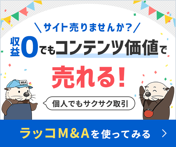
Not a member? Why not join us or log in? (No more hassle filling in comments, less obtrusive ads and asides.)

Getting Design Approval: The Single Mockup Theory

Posted by Darren Hoyt on May 26th, 2008.

Interactive designer, blogger and art director from Virginia, USA.

http://www.darrenhoyt.com

Darren Hoyt has posted 1 articles.

RSS Feed for fadtastic.net RSS Feed for Darren Hoyt

Full Profile →

For years, my employer has included this line in their standard contract: “We will propose 2-3 homepage mockups and a single secondary page mockup”.

There are variations on this throughout the industry, but overall it’s pretty standard, the assumption being that clients should see multiple concepts before choosing a direction for their website.

But it doesn’t often work.

Never having faced these kinds (or any kind) of design choices before, the client often takes the weakest elements of one mockup, suggests merging them with the weakest elements of the other mockup, and because they’re paying you big dollars, you’re expected to comply.

Now you’re both stuck. You’ve allowed them to settle on a mishmash Frankenstein product and bogged them down with a maze of choices rather than doing the right thing — using your expertise to steer them in the right direction.

What’s worse is that the endless back-and-forths with the client have wiped out your design budget. You’ve got zero remaining hours for your Frankenstein homepage and minimal hours left for designing important secondary page concepts like product listings or blog pages.

Reverse the Numbers

In the past year, I’ve pushed to change our standard contract to say, “We will propose 1 wireframe, 1 homepage mockup, and 2-3 secondary page mockups”. So far the result has been distinctly happier clients and happier designers.

Why? The underlying idea is that a design budget is better spent with ample planning, strategy and confidence applied to one “definitely” design, rather than letting clients chase after multiple “maybe” designs.

Meetings and Exploratory Time

Initial meet-and-greets are a great opportunity to squeeze the client for information on their tastes and their industry. If they’re overwhelmed or unable to offer useful information, it’s your job to get them in touch with their own opinions.

I’ve found it helpful to use a big-screen projector while browsing select sites from CSS Beauty or Most Inspired or Best Web Gallery. Try to gauge what ‘moods’ the client responds to, as they relate to specific colors, shapes, layouts and typography. It should become apparent what the client likes, and more importantly, doesn’t like. If they’re still indifferent, explain to them which sites work for you and be specific about why.

I also have clients bring in marketing materials like business cards, photos and brochures. Lay them out on the table and see what they do and don’t like about their existing business identity. If they absolutely need certain elements from their print materials to carry over to the website, discuss ways you can and can’t deviate.

We’ve now established some things about design aesthetics, but before the meeting is over, we also want to establish the content types that will display on the homepage: marketing text, taglines, blog excerpts, featured products, masthead imagery. Break them into modules and sketch it on paper if necessary, or use a tool like Best4C.

By now we have both ‘mood’ and modules established, which will make it easier to determine the sort of layout we’ll need: minimalist, blog style, magazine style, corporate, or otherwise. When the meeting is over, both designer and client should leave with a clear mental picture and be ready to set a single design strategy in motion.

Moodboards, Wireframes & Info Design

If the client is on a smaller budget, you may need to skip ahead to creating a polished homepage mockup. Otherwise, it’s good to use the post-meeting/pre-design phase for making preliminary sketches either in the form of wireframes or simple moodboards.

The ‘Polished’ Homepage Mockup

Once these general blueprints are client-approved, the table should be set for you to create a focused, polished mockup. I’ve found client approval to come more easily if the mockup is presented with thorough notes on why your design team felt it worked, was strong, and represented them well. As we are the appointed experts in this case, they are often willing to listen.

Why Multiple Secondary Mockups?

If the client’s site will have dynamic features like a shopping cart, for example, mocking up the interior product pages is going to be pivotal. Clients who barely care about the color scheme on their homepage will definitely, and loudly, have opinions on the user-experience of their store. Plus, you and your production team will need to know how static pages and sublevel navigation will look. If you already hit your single homepage concept out of the park, there should be plenty of budget left over for getting these interior pages on track and providing additional mid-phase information design.

Why additional information design? Because no matter how “100% sure” a client is about the content materials they provided upfront, trust they will ALWAYS need help re-organizing their content halfway through the build process, once they’ve seen it on the screen.

It’s our job to be patient throughout the strategy process — what’s second-nature to us is likely to be completely foreign to them. Ideally, we should know when to take charge and when to collaborate equally.

Related Quotes

DesignBit:

This process of creating one mock up is really trying to get the message across that if you take more time accessing the clients needs with well planned data gathering / analysis you will get the mock up that’s a good fit for the company first time.

Paul Boag/24 Ways:

Many clients like the idea of having the option to choose between multiple design concepts. However, although on the surface this might appear to be a good idea it can ultimately be counterproductive for design sign off.

In a world of limited budgets it is unwise to waste money on producing designs that are ultimately going to be thrown away. The resources would be better spent refining a single design through multiple iterations.

What is more, multiple concepts often cause confusion rather than clarity. It is common for a client to request one element from one design and another from the second. As any designer knows this seldom works.

Garrett Dimon:

If you present clients with multiple ideas and expect them to choose one, invariably, the end result is muted and diluted as the message of the different ideas gets blended together. This is what happens when you approach the situation with an offering.

Instead of spending time creating 3 differnt comps, ideas, or concepts, take aim at that one that’s great and make it amazing. Blow them out of the water. Leave them speechless. That’s guiding.

It’s really about taking them where you feel and know they need to go. You may be a little off course and that is to be expected. Believe it or not, your clients are looking to you for answers, and they want to help you find those answers. They are looking to you for guidance to the best solution.

Make A Comment

( 29 so far )

blockquote and a tags work here.

29 Responses to Getting Design Approval: The Single Mockup Theory

Comments RSS Feed

I generally use two approaches: I present or a single mockup (the best one out of a series of grahical attempts) or the early grahical attempts (through Basecamp) using an agile approach and involving the customer in the decisional process.

Cristiano Rastelli
May 26th, 2008
#

I have come to dislike the idea of showing the client a variety of sites to try to understand their likes and dislikes. I believe websites should be designed graphically to suit the likes and dislikes of the site users, not the site owners, and too many site owners are unable to separate these two very different ideas. I prefer to ask site owners, "What perception do you want your site users to have regarding your company/service"? Then I try to give them a design that fulfills that goal.

Steve Rose
May 26th, 2008
#

I believe websites should be designed graphically to suit the likes and dislikes of the site users, not the site owners, and too many site owners are unable to separate these two very different ideas.That’s a great point. When I broach this with clients, they often suggest that they know their industry very well, thus they are  part of their own audience and can identify with what users need. Sometimes they are projecting these needs on their users and it doesn’t work. It’s not directly addressed in the article, but yeah, Audience is obviously a major part of the strategy process.

Darren Hoyt
May 27th, 2008
#

At my job we just present one mock-up with several secondary page mock-ups, because it’s just the best way - no Frankenstein :-)

Tor Løvskogen
May 27th, 2008
#

It has been my experience that if presented with several different mockups a client will more often than not go for the ‘mashup’ of designs - a bit of this, a bit of that, much to the frustration of the designer.

Michelle Sullivan
May 27th, 2008
#

Steve Rose said:"I believe websites should be designed graphically to suit the likes and dislikes of the site users, not the site owners, and too many site owners are unable to separate these two very different ideas."Amen! I actually turned down an otherwise attractive position in an agency because the client I would be focusing on could not grasp this concept. The attitude was very much "we know what our visitors want," and the expectation was that I would merely code what the client asked for, not what they actually needed.

Heidi
May 27th, 2008
#

I think there’s a lot of sense in this article as I’m sure we’ve all come accross the same situation: you create three mockups - one really creative concept, one really conservative concept, and one middle of the road concept. Sure enough, nine times out of ten the client picks the ‘wrong’ concept - the middle of the road idea. Why did we even give them the option?However, I think there’s more to this. We have to accept that as creative types, we’re always going to prefer that slightly more leftfield concept - that’s our nature. The client who’s expectations are shaped somewhat differently to ours, is probably hoping for something a bit more conventional than we would like - a ’safer’ option. Does that mean that we’re right and they’re wrong? I don’t think so.The argument of this article can work the other way too, because if you present only one option and the client doesn’t like it, then time and budget can get spent bending the concept to something the client does like. Sometimes providing multiple concepts allows the client to feel involved and have some input into the overall decision, without the project turning into design by committee or some beastly frankenstein.

Aaron Russell
May 27th, 2008
#

Total agreement here, great article! We started offering 1 concept about a year ago. We explain to them that we’d rather give them 1 strong concept rather than several weak ones and they seem to understand that. Often they still request more than 1 and we honor that too, but I agree that almost always, 1 concept gets better restults. Anyhow, when you offer more than one, there’s always one you know is better and the client picks the worse one, right? Or the frankenstein mish mash, which is yuck too.I agree with Steve on putting too much importance in what type of site the client likes. This can be helpful depending on the level of knowledge they have about the industry or web in general, but sometimes they don’t really know. It’s up to you either way to research their industry as much as you can and make something in line with that.Interesting about the Mood Board idea. I never heard of that! We pretty much do wireframes on all sites nowadays, whether the client sees them or not. I think it helps the design process a lot later.  

Naomi Niles
May 28th, 2008
#

Brilliant article, thanks!  

Harry Roberts
May 28th, 2008
#

Sometimes I dont have to redesign/change anything, though this depends on the client’s input and last minute overhaul changes.Usually we have two stages: proposal and  after clients give their opinion changes and refinement go on that what the final website will be.    

johan
May 28th, 2008
#

Great article and great comments. I’ve been providing my clients with two design drafts up till now and I think I’m going to change that now to one homepage design and a couple of secondary "inside" pages.  I give all my clients questionnaires where I try to dig out as much information about the sites that they like, dislike, colours they like and so on. That often yields a lot more information than when I meet them face to face because they seem to take a bit more time on the questionnaire and are under no pressure to give answers to me. So I try to take their "likes" and build them what they need and make as many recommendations as possible if they are erring off onto some sort of web monstrosity. 

Jennifer
May 29th, 2008
#

I’ve been doing this for a few years, the key is to have a very solid process, where the client approves and has input into the requirements list, the site architecture, the wireframes and the color scheme before they see the design. If you’ve done that, then they already have some idea what the concept will look like, and it’s easy to get them to sign off on it. If you just ambush them with a concept from out of nowhere they will resist, and demand changes or new concepts.

J. Jeffryes
May 30th, 2008
#

because if you present only one option and the client doesn’t like it, then time and budget can get spent bending the concept to something the client does like.Our standard contract only provides 3 rounds of design feedback. If by the 3rd round we feel like we’ve done our best work and are presenting something that represents best design and best practices, but the client is still displeased, we hit the brakes and decide whether to re-cope the budget or to offer the client ‘other options’ (aka, referring them elsewhere). This almost never happens, FWIW, but if  it’s clear the client is going to insist on a piece of work that we don’t think is good, we’d rather them work with a firm that suits them better than to prolong a doomed process.  It’s up to you either way to research their industry as much as you can and make something in line with that.Interesting about the Mood Board idea. I never heard of that! We pretty much do wireframes on all sites nowadays, whether the client sees them or not. I think it helps the design process a lot later. I give all my clients questionnaires where I try to dig out as much information about the sites that they like, dislike, colours they like and so on. That often yields a lot more information than when I meet them face to face because they seem to take a bit more time on the questionnaire and are under no pressure to give answers to me.  If you’ve done that, then they already have some idea what the concept will look like, and it’s easy to get them to sign off on it. W3c, or sketchpad. 

Darren Hoyt
May 30th, 2008
#

The argument of this article can work the other way too, because if you present only one option and the client doesn’t like it, then time and budget can get spent bending the concept to something the client does like.

Our standard contract offers up to 3 rounds of design feedback. If after 3 rounds the client is still displeased but we feel like we’ve done our best design using best practices, we will hit the brakes and re-scope the budget. Or, we offer the client ‘alternatives’ (aka, refer them elsewhere). FWIW, this almost never happens, but I’d rather them work with someone whose tastes and process suits them better than to prolong a relationship that isn’t working.

It’s up to you either way to research their industry as much as you can and make something in line with that.

Exactly. If the client is giving a deer-in-the-headlights look when asked for input, it’s up to us to dig deeper to research their industry and competition. Granted, if it’s clear the client isn’t equipped to offer timely content or feedback, it’s sometimes necessary to add additional design hours to the budget for assembling content and experimenting. A more prepared, on-the-ball client always pays less.

I give all my clients questionnaires where I try to dig out as much information about the sites that they like, dislike, colours they like and so on. That often yields a lot more information than when I meet them face to face because they seem to take a bit more time on the questionnaire and are under no pressure to give answers to me.

The questionnaire approach can be really helpful. FWIW, I usually give them a copy a couple weeks before the kickoff meeting so that they have some things to discuss in person. Even when the  responses aren’t 100% helpful, it’s a good conversation-starter, and a reminder that they will need to actively contribute to the project, not passively expect results. 

If you just ambush them with a concept from out of nowhere they will resist, and demand changes or new concepts.

Before the end of a kickoff meeting, I try to have something already sketched, either with the Best4c tool or even drawn on paper. If nothing else, a list of homepage modules that we both agree on, so when presented with a mockup later on, they won’t feel surprised or ambushed by the layout.

Darren Hoyt
May 30th, 2008
#

We generally use a single mock up approach for all our work. We find that using a workflow of a project sheet (either filled in by the client or by us and the client), writing a spec & scope document (usually with wireframes), then presentation of visual (usually 2-3 key pages). We then have a meeting and produce any amendments. Often we can so these in the template / build stage.

Jon Kokke
June 1st, 2008
#

This is a really great post. I have been so frustrated with offering 3 mockups. I think you are so right to offer one. This also places the finances of the design budget into the slot of "really discovering what the client likes to get it right the first time" Great ideas, love the blog 

Aaron Mills
June 2nd, 2008
#

I work for an agency as a creative director and have found that very few clients will accept the 1 mock approach. I have tried this idea and when our AE is speaking with the primary stakeholders, rarely will they go for this approach. As the creative director, it is my responsibility to steer them in the right direction and they usually pick the best design. From there we build the interior comps based off of the approved index comp.

Kirk
June 2nd, 2008
#

It’s usually the clients with no artistic taste who are very picky!

MJ
June 3rd, 2008
#

- Mostly clients set up the wireframe?- Many clients often include references to sites they like. - Without the necessary content a mockup seems sterile?

Johan
June 9th, 2008
#

Great discussion. What about presenting a single mockup, but allow customers to collaborate on the design using a program like Gliffy? This way you can allow them to specifically suggest what types of changes they have in mind (but you still have the option to revert to earlier versions). No matter what trends occur, people always want their opinions heard!debik at gliffy dot com 

Debi K
June 9th, 2008
#

I like this theory. I always thought I was giving clients options by doing several mockups. In reality, I’ve always produced one really detailed comp; then reproduced the same layout in slightly different color schemes - making the client think they were seeing something different. I actually listen to clients and what they think they want but ultimately, I’m the designer and I know what I’m doing.

OneHipSista
June 10th, 2008
#

Absoletely true. Spend as much time and resources in the planning stage, really learn the clients likes and dislikes, and then present them the one. Your pitch should be, this is what we think is the best solution for you. The more versions you give them, the longer it will take and usually overall the worse and more muddled and unfocused it will be.

Aaron
June 12th, 2008
#

Nice post, do you have any on how to defend logo designs….I always have pronlems with that :(

flashy
June 19th, 2008
#

This is a really great post. Excellent atricle… 

abdul
June 21st, 2008
#

Brilliant post, thanks for sharing.

Sonali Sengupta
July 4th, 2008
#

Good insight. I normally work on 2 drafts based upon a series of questions, slected reference sites from the client, my own research, and the corporate identity of the company. Generally, people like to have choices and providing 2 well conceptualized drafts solves this. It also shows that you hae done your homework and is serious enough. At the end, it’s up to the agent to direct a disgruntled client into closing on a concept.

Klans
July 20th, 2008
#

I had never thought about suggesting only one markup.  It makes perfect sense though, especially if you do good homework on what they are looking for.  I really liked the idea of projecting a CSS gallery to get feedback.  Thanks for the article.

Ryan Battles
July 21st, 2008
#

Great resource for a begginer like me. Thanks.

acms
July 28th, 2008
#

go land stone joke speed white water vacant home usa minor mail

jhonnight
August 6th, 2008
#

↑ Jump up to the comment form

Related In Some Way, Shape Or Form

The above post has obviously kept you amused. Why not discover similar material:

The posts Watch the birdy!SEO - Should search engines matter in your campaign?What happened to :: ?Design Resources of the MomentHow Do You Lay Out The Layout?, are related to this post.

Or why not take time out to find out about the author of the post.