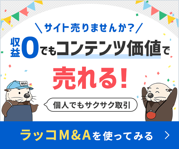
How Do You Lay Out The Layout?
Posted by Abhijit Nadgouda on December 30th, 2006.
One of the tough decisions for web designers is about flow the layout. Should it be fixed or liquid? Wait, there is also elastic! You can also choose hybrid layout which can be a combination of any of these. Of course, there is always a personal choice, but are there reasons? All these different options have their pros and cons. This discussion has survived the table era and is quite hot in the current CSS era. Each option has been bashed up by the other party. However, it is usually because the opposition considers only the disadvantages, only the things that are difficult with a certain approach. What I see missing is context of the web site. Is it possible to come out with justifications for the disadvantages using the advantages for context of the web site under discussion? Without a web site to consider this discussion is sure to end up in a stalemate. I have not been able to take extreme stands, but I do believe that for a specific web site one can be better than other. Today, we also have the luxury of additional information like the report on actual browser sizes.
I always think that the biggest influence on design decisions is the context which is usually the answer to combination of the questions
- What is the website about?
- Who will use the website?
It is a fact of life that you can never expect to normalize resolutions and browsers among the users. And this variety leads to a range of real estate available for a web page to use. The question of which layout to use boils down to need to optimally use the available real estate. However this comes up with giving up a bit of control on the design. Rather, that how the web page will look now depends not only on your design, but also on the user environment.
This is one of the issues where you might never be able to decide affirmatively. It can come out of a jugglery of various factors like the time, the effort, the cost and of course the requirements. Over time I have come up with my own way of trying to decide which one to use, they are listed here, not in any particular order:
- I usually consider the amount of information that has to be shown in a context. If the information tends to be on an increasing side, I tend towards the liquid or elastic layout. If it can be contained then a fixed layout might work.
- If it is a graphically oriented site, then I tend to go for the fixed width. It is not that the liquid layouts do not work, just that it gets more difficult to design. Of course, as a challenge it is one thing, but from the project’s perspective I tend to move from “Why not liquid” to “Why liquid”.
- The biggest disadvantage of the fixed width layout is that there is no single fixed width for all devices. So, if it is possible that the website readers are going to use various devices, then liquid layouts might help.
Designing liquid layouts cannot be said to be more difficult, but there are more precautions to take. More flexibility requires more attention! There are usability standards for length of readable text line. If proper care is not taken this can lead to designs difficult to read. There is also a possibility that, if the widths are not properly assigned, the design might differ a lot across various resolutions.
This is an issue where there cannot be recommendations or a single definitive answer. We will, or at least I will, always only tend to support one over the other. In such cases, it has been beneficial for me to observe as many designs as possible and analyze them in context of the web sites. While I cannot say that these observations have helped me learn, they have definitely helped in improving my judgements. What have been your experiences? How do you take these decisions? Which layouts do you prefer, both as a designer and a user?
Make A Comment
( 12 so far )
12 Responses to How Do You Lay Out The Layout?
I’ve mostly only done fixed width layout, however I have done liquid and elastic, and I enjoyed designing a liquid site.
Elastic has been the most challenging but I’m still not used to using ems for layout.
I agree, that it depends on the site. I design with all three layouts when it is appropriate. You have to know your audience and what type of screen/system they are using.
If my users are in the 1280×1024 and 1024×768 range then I would feel good about a fixed 920px or a fluid margin based layout. If I had to design for +1280px screens (like advanced corporate or total design geeks that have 22inch widescreens) then I would go with a large fixed layout so that the users eye didn’t have to wonder across a 20inch paragraph.
However, I like to stick with fluid if I have everyone from a cell phone to a dual-LCD setup visiting my site. Let them choose how big or small they want it. Make the site fit their screen.
There are usability standards for length of readable text line.
what do you use as a standard?
Usually 45-75 characters per line. the lower end of this is for multiple columns of text, you’ll want to keep around that 45-55 range.
I always design both fixed and liquid layouts, but I think fixed layouts are more official - Corporate Identity issue, see because companies require most of the time to have a fixed style, but when designing a personal or a Flash based site I think it’s always fixed, that’s what I think because you can used the option of scrolling and/or scenes styles, but usually it’s up to the design it self.
Most of my designs are fixed to 775×600px, it’s a perfect size for those who use the 800×600px, put if going wide screen I prefer th 920px.
I tend to go for the liquid approach. But one cannot assume that a particular type of layout is right across many designs. When I build a site I imagine what type of layout would work best for the content.
There is a great article on A List Apart by Marc van den Dobbelsteen about using javascript and css for variable layouts.
I have had a bit of a play around with it and it is really good fun to work with. I’m definitely thinking of using it in the next website I build.
Interesting find, David. Thanks. This may come in useful.
I often am highly illustrative when I design, and sometimes a liquid, elastic or any layout that especially uses ems so it can be resized can make maintaining this illustrative quality hard to maintain when the user inevitably moves items of the layout around.
Graphics break, backgrounds aren’t the correct width anymore… until we have a web browser image format that supports resizable vector (and not flash) I’m going to find designing in these styles very hard indeed.
Richard
I am working on different computers with different resolutions and different browsers. But websites look more or less the same to me. Why? Because I never maximise the browser window. I hardly ever maximise any application. It is a weird habit to force something that is designed for a narrower screen to fill the entire screen.
So maybe a little education in how to view in a window would take away some of this discussion? If you have a 1600×1200 screen, it will look the same as on a 1024×768 screen as long as you do not maximise…
I do mostly portal design for work and that is pretty much all liquid (or fluid) layout. When I do a brochure site or something similar, I usually go to fixed width for the sake of readability. I will have to try the elastic approach in the future. Interesting read.
Related In Some Way, Shape Or Form
The above post has obviously kept you amused. Why not discover similar material:
The posts Open Feedback, Who To Design For?, Beautiful sites with no (or very few) images, Are ads okay yet?, Best of the reboots ‘07, are related to this post.
Or why not take time out to find out about the author of the post.


